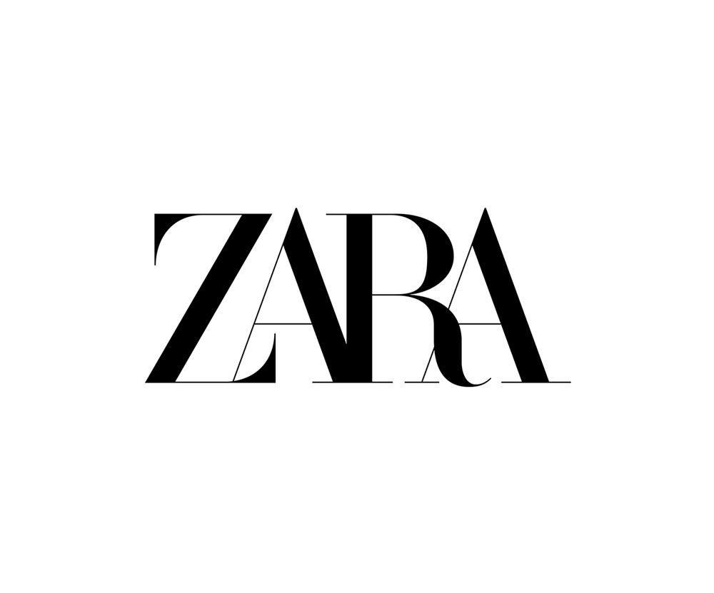
On January 27th 2019, for the second time in the brand’s history, Zara unexpectedly changed its logo.
Since its creation in 1975, the company has only changed its logo twice. The first time was in 2010 where they made a minor adjustment regarding the spacing between characters. The more separated look gave the brand a high fashion personality like Givenchy’s, Gucci’s or Versace’s.


This time, with the launch of their S/S 2019 collection, their logo change was much more important. The firm Baron & Baron, mandated for the design, completely removed the spacing and even changed the font! The result: an all attached name with a more rounded typography.

We recognize certain elements that we often find in the world of streetwear and fast fashion, such as the superimposed letters of Stussy and Dope or the rounded shape of H&M.

We’re not sure yet if this change is a good idea, or even if we like it, but one thing is sure: we are shocked by this drastic shift. Aren’t you?
We’ll probably get used to it exactly as we did when Instagram changed their app icon back in 2016…. or not. Time will tell us.


